


(Statista)
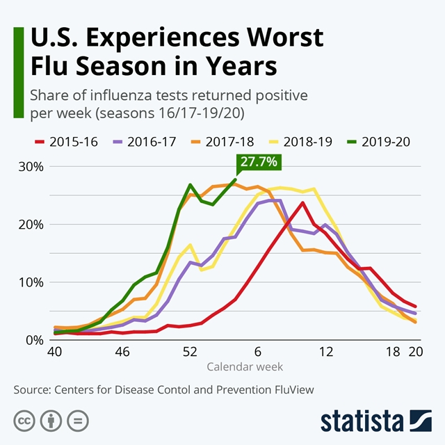
15 Feb. 2020. While much of the world’s attention is focused on the novel coronavirus, now code-named COVID-19, the flu season in the U.S. is no day at the beach either. According to data from the Centers for Disease Control and Prevention, the infection rate for this year’s seasonal influenza is among the highest in the past five years.
The business research company Statista charted the CDC’s data, displayed in our weekend infographic. Not only did the rate of positive lab test specimens in late January reach nearly 28 percent, that rate began dropping during the first part of January, only to rebound toward the end of the month. And not shown on the chart is the latest report from CDC showing the positive test rate rising last week to nearly 31 percent.
The best protection against the flu, of course, is the annual flu vaccine, particularly for people at higher risk of infection: those age 65 and older, pregnant women, young children, and people with chronic diseases. And don’t put it off. CDC estimates that so far this season, the flu caused at least 12 million medical visits, 250,000 hospitalizations, and 14,000 deaths in the U.S.
More from Science & Enterprise:
- NIH Launches Universal Flu Vaccine Trial
- Trial Testing Universal Nasal Spray Flu Vaccine in Children
- Pfizer, Biotech Partner on RNA Flu Vaccine
* * *
 RSS - Posts
You must be logged in to post a comment.